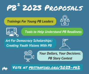
As we celebrate the first 30 years of participatory budgeting (PB) in the world and the first 10 years of the Participatory Budgeting Project (PBP), we reflect on how far and wide PB has spread–and how it continues to grow! We’re thrilled to introduce a new tool to help us look back as we plan for the next 30+ years of PB. And so we’re introducing a map of PB across the U.S. and Canada. Each dot on the map represents a place where democracy has been deepened by bringing people together to decide together how to invest public resources in their community.
How can you get the most data out of this map?
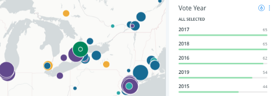
Try playing with the “widgets” located to the right of the map that visualize different classes of data.
- By default all of the processes show up first but you can select any particular year you are interested in.
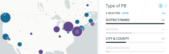
- You can also view a count of how many PB processes of a particular sort took place within the portion of the map you are viewing. For example, you can find out that in 2018 there were 56 PB city-wide, county-wide, and district-level processes in the US and Canada–our biggest year for PB yet!
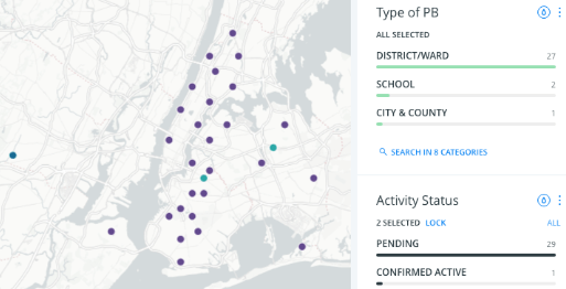
- Or, try selecting one year and zooming in to your own neighborhood to find active or pending PB processes in your community. If you click on a dot you can get more info about the process, such as how large the budget was, how many voters turned out, and where to find its website.
The map is linked to the database that PBP maintains to try to track every PB process in the U.S. and Canada. Inevitably some PB processes aren’t on our radar.
If you know that PB exists somewhere not seen on our map, or you have additional data about a PB process, please fill out this form to let us know!
If we listen closely, we hear messages from this data.
This data sheds light on larger questions, such as what is the relationship between the size of PB budgets and the number of people who participate? Looking at PBP data on processes in counties, cities, and urban districts, we find a positive correlation between the size of the PB budget per person and the number of people who take part in a PB vote (r=.22, n=245). In other words, where officials make a stronger commitment to funding PB, more people take part in the process–all the more reason to continue growing PB!