Table of Contents

Please note: This page is not formatted for mobile, it is meant for desktop reference only.

Logos

Color Options

PBP Logo
PBP Logo

B/W Options

PBP Logo
PBP Logo
PBP Logo
PBP Logo

Brand Colors

Primary

Light Teal
Hex #b8e6e2

Teal
Hex #4299a0

Secondary

Light Green
Hex #09d6ab

Green
Hex #64c4b9

Light Yellow
Hex #e6fc56

Light Blue
Hex #a5bdfd

Tertiary

Dark Teal
Hex #3d7f8d

Dark Green
Hex #3f897a

Yellow
Hex #e9ec5b

Dark Yellow
Hex #bac132

Blue
Hex #4870D5

Dark Blue
Hex #425ea8

Neutrals

White
Hex #ffffff

Cream
Hex #fcf9f2

Gray (Text)
Hex #4b4b4b

Dark Gray
Hex #232323

Black
Hex #000000

What the Ratings Mean:

AAA – This is enhanced contrast with a score of at least 7.0. Think longer form articles that will be read for a significant period of time.
AA – This is the sweet spot for text sizes below ~18pt. This is a score of at least 4.5.
AA Large – The smallest acceptable amount of contrast for type sizes of 18pt and larger. This is a score of at least 3.0.
Fail – Your text doesn’t have enough contrast with the background. You probably want to make it darker. This is a score of less than 3.0.

Read More: https://usecontrast.com/guide

Accessible Color Combinations for Text

block.png

Please don’t use these color combinations; they do not meet a color contrast ratio of 4.5:1, so they do not conform with the WCAG standards for body text. This means that some people would have difficulty reading the text. Employing accessibility best practices improves the user experience for all users. (GitHub Accessible Color Matrix)

Accessible Color Combinations for Color Blindness

Colors tested for conflicts using Adobe’s Color Blind Safe tool. No conflicts found. Swatches are color blind safe.

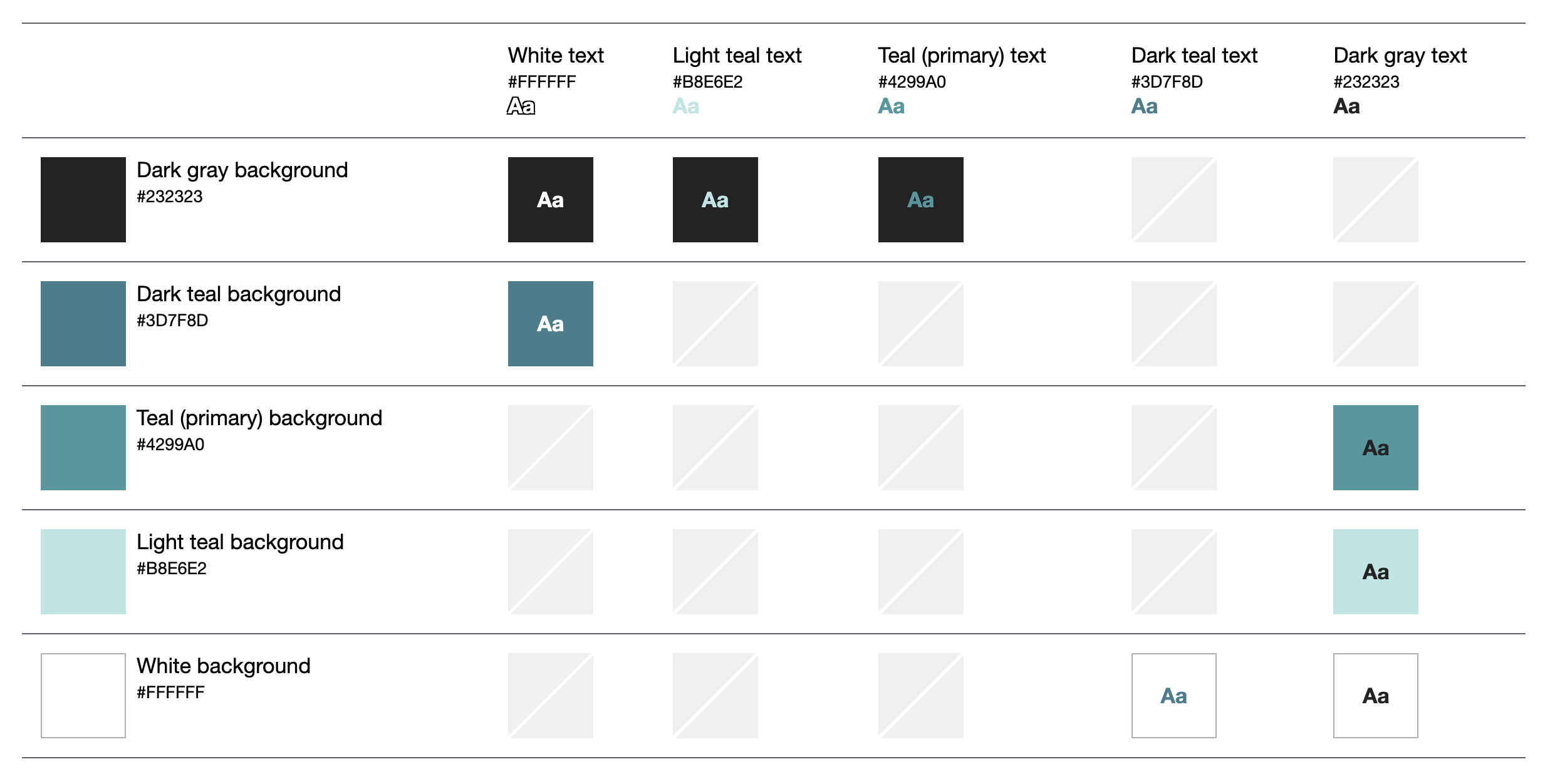
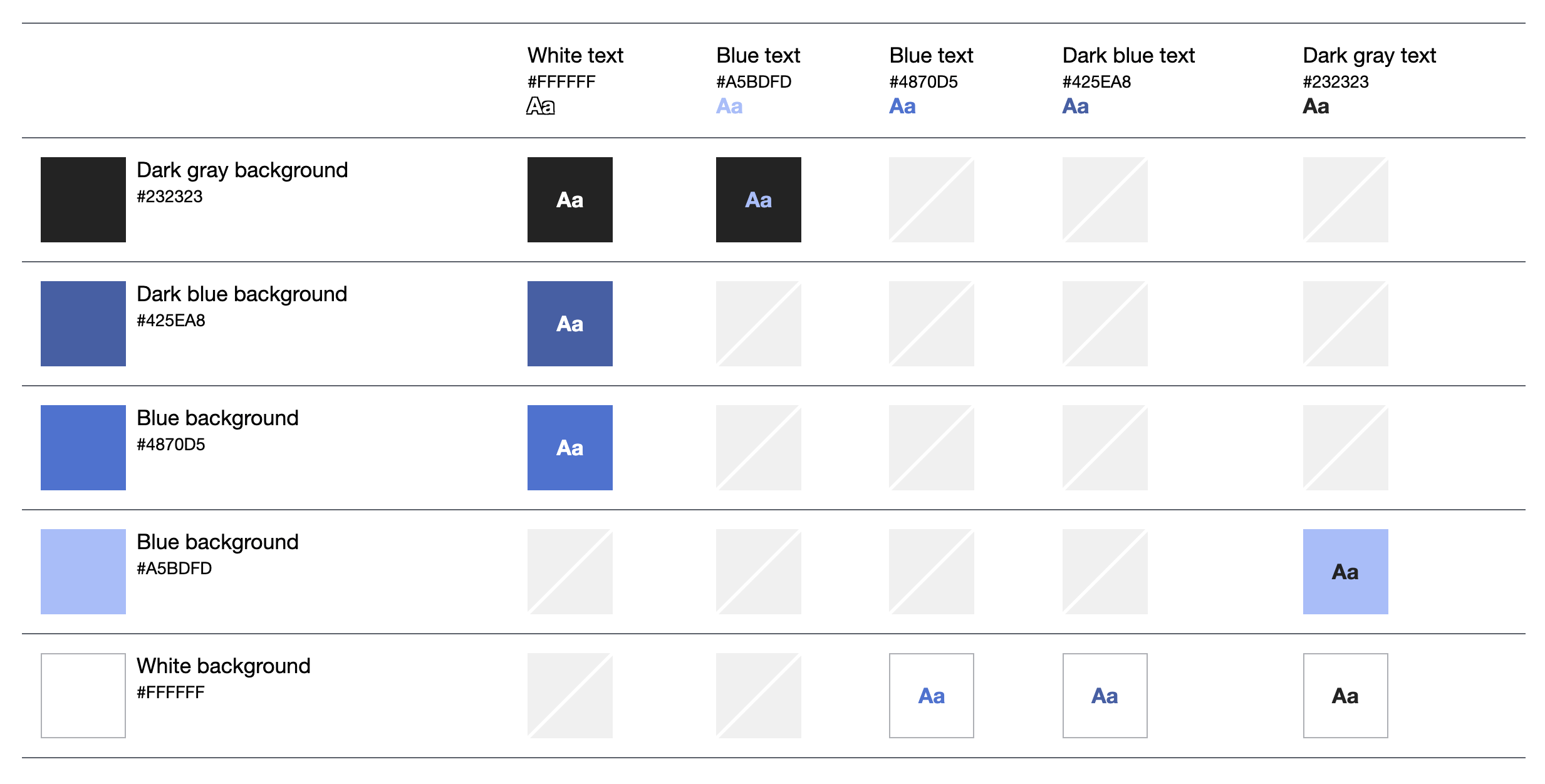
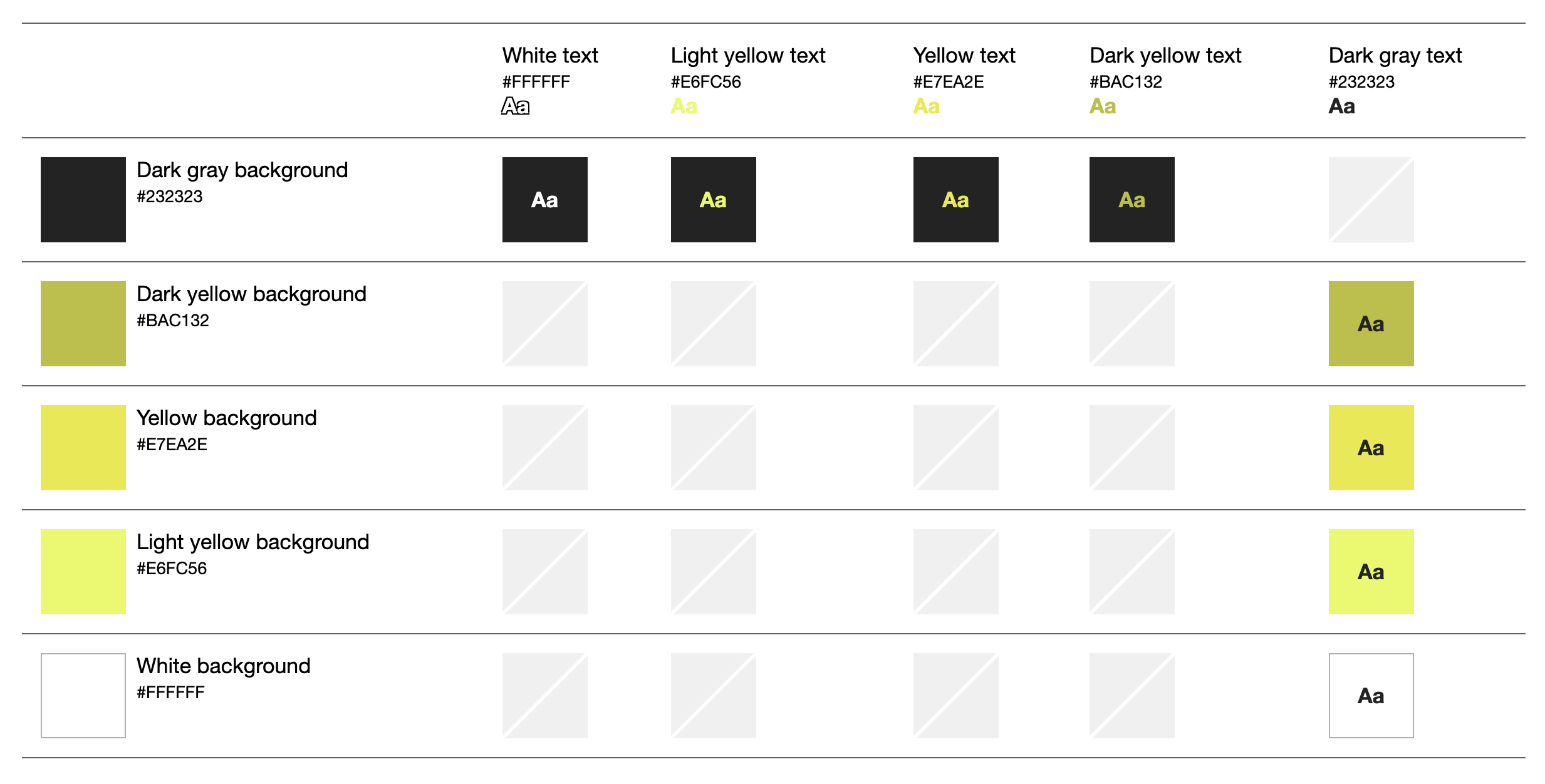
Accessible color themes won’t make a viewer with color blindness see the same colors as a normal viewer. Instead, think about it like this, if your original design requires every user to perceive five different colors then you need to make sure that all five colors are perceived differently. For people affected by color blindness, some specific combinations of hues and shades can lead to confusion, making such colors practically indistinguishable. 

Deuteranopia and Protanopia are both types of the “red-green” color blindness, while Tritanopia is of the “blue-yellow” kind, with these color pairs referring to the potential conflicts for each kind of viewer.

Typography

H1 - Title Text

H2 - Title Text

H3 - Title Text

H4 - Title Text

H5 - Title Text
H6 - Title Text

Default Fonts

Headings - Poppins
A B C D E F G H I J K L M N O P Q R S T U V W X Y Z
a b c d e f g h i j k l m n o p q r s t u v w x y z
0 1 2 3 4 5 6 7 8 9
! @ # $ % ^ & * ( )

Body text – Nunito Sans 400 (Normal) – 20 px
A B C D E F G H I J K L M N O P Q R S T U V W X Y Z
a b c d e f g h i j k l m n o p q r s t u v w x y z
0 1 2 3 4 5 6 7 8 9
! @ # $ % ^ & * ( )

Lorem ipsum dolor sit amet, consectetur adipiscing elit. Ut elit tellus, luctus nec ullamcorper mattis, pulvinar dapibus leo.

Typescale

The typescale for headings uses Major Third intervals and a base size of 16px. All headers are set up in REMs that are multiples of the base font size (see below). This allows users to easily update the base font size in their browser to their preferred size for viewing. This type scale was generated using this tool.  Read more about how REM are more accessible here

Iconography

Site wide imagery is a mix of line drawings and photography from PB processes, trainings or other events.

PB Process Icons

These icons are used to illustrate the six phases of a PB process. They are also sometimes used as decorative visual elements to break up text. They can be static or animated to have motion. They are set up as an icon set, so you can easily recolor them to any of the brand colors. 

Additional Design Elements

Tables

Header Col 1
Header Col 2
Header Col 3
Column 1
Column 2
Column 3
Column 1
Column 2
Column 3
Header Col 1
Header Col 2
Header Col 3
Column 1
Column 2
Column 3
Column 1
Column 2
Column 3